Creating a Column Chart
Column charts use bars of varying lengths to indicate
amount. The bars are of different colors or patterns
to indicate the different type of data, and they run
vertically across the chart.
 Open your expenses workbook.
Click on the Sheet 2 tab at the bottom of the
expenses workbook to enter the data for
your column chart.
Create a worksheet that looks as follows:

Remember to use Excel's Copy features that you
learned in the previous part of the tutorial.
Select the data to be charted.
Choose Chart from the Insert
menu.
The following should appear on your screen:

Choose the chart type: Column
and click on the Next button.
Choose following format type

and click on the Next button.
The following should appear on your screen:

If the range is correct, click on the Next
button.
Insert the following on the titles tab and click
the Next button.
Observe:

Select the following options and click the
Finish button.
Observe:

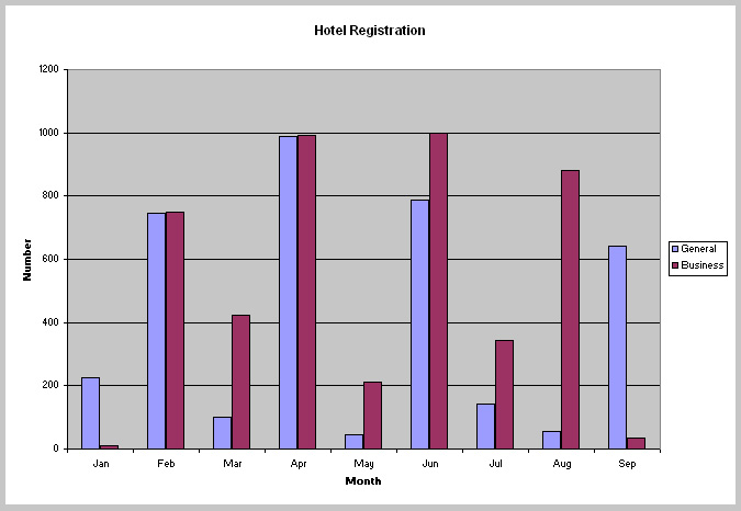
Your column chart should look as follows:
Let's format the column chart.
Select the business (data series) columns and
make them yellow.
Select the general (data series) columns and
make them green.
Your column chart should look similar to the
following:

Select a grid line and choose Selected Gridlines
from the Format menu.
The following Format Gridlines dialog
should appear:

Choose a different style for the line and click
the OK button.
Lastly,let's change the alignment of the text that
makes up the months.
Select the X-axis.
Choose Selected Axis from the Format
menu.
Within the Format Axis dialog box click
on the Alignment tab.
Select the following option and click the
OK button.
Observe:

Your column chart should look similar to the
following:

Preview your chart.
Clear the Chart 2 and Page 1 text in the Header and
Footer respectively using the Page Setup
command.
Print a copy of your column chart.
Congratulations! You have finished the Excel tutorial.
Return to the main page to view the homerwork assignment.