Creating Charts


Before you can draw a chart using Excel, the numbers that compose the chart must be entered in a workbook. There are five general steps in defining a chart.

Steps in Creating a Chart:

  1. Enter the numbers into a workbook.

  2. Select the data to be charted.

  3. Choose Chart from the Insert menu.

  4. Choose either Chart Type from the Format menu or click on the ChartWizard button.

  5. Define parameters such as titles, scaling color, patterns, and legend.


These five steps should be performed in this order. Note that since the chart is linked to the workbook data, any subsequent changes made to the workbook are automatically reflected in the chart.


You will be making two charts in this part of the tutorial. The first chart will be a pie chart and the second chart will be a column chart.


Creating a Pie Chart


Pie charts are used to show relative proportions of the whole, for one data series only.

Data series are a group of related data points.

A data point is a piece of information that consists of a category and value.

For example, if you were collecting data on how couples first meet, then the number of couples who met through friends would be a data point. In this case the category is "through friends" and the value is the number of couples who met that way.

When you create a chart with Excel, the categories are plotted along the horizontal or X-axis, whil the values are plotted along the vertical or Y-axis.

Data series originate from single worksheet rows or columns. Each data series in a chart is distinguished by a unique color or pattern.You can plot one or more data series in a chart except for pie charts.

An example of a data series is the population of the United States over ten years. Each data point would be made up of a year (the category) and the population in that year (value).

The first step in creating any chart is to enter the data on a workbook.

Find and open Excel 97 if it is not already open.

Make sure your toolbars and formula bar is displayed.

Open a new workbook.

Save your workbook and name it "expenses".

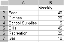
Enter the following into your expenses workbook:


You will be using the ChartWizard to create your pie chart.


Using The ChartWizard


The ChartWizard is a series of dialog boxes that guides you through the steps required to create a new chart or modify settings for an existing chart.

When creating a chart with the ChartWizard, you can specify the worksheet range, select a chart type and format, and specify how you want your data to be plotted. You can also add a legend, a chart title, and a title to each axis.

There are two commands and two buttons that start the ChartWizard. The command you choose or the button you click will create either an embedded chart or a chart sheet.

An embedded chart is a chart object that has been placed on a worksheet and that is saved on that worksheet when the workbook is saved. When it is selected you can move and size it. When it is activated, you can select items and add data, and format, move, and size items in the chart.

A chart sheet is a sheet in a workbook containing a chart. When a chart sheet is created, it is automatically inserted into the workbook to the left of the worksheet it is based on. When a chart sheet is activated, you can select items and add data, and format, move and size items in the chart.

In this tutorial you will be creating chart sheets only.

Select the data you just entered.

Choose Chart from the Insert menu.

Observe that the ChartWizard's first dialog box appears:


You want a regular pie chart not a 3-D pie chart.

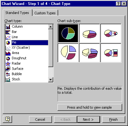
Select the chart type: Pie and click on the Next button.

The following dialog should appear:


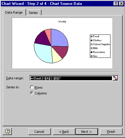
Read the dialog box, make sure the range is correct and then click the Next button.

The following dialog should appear:


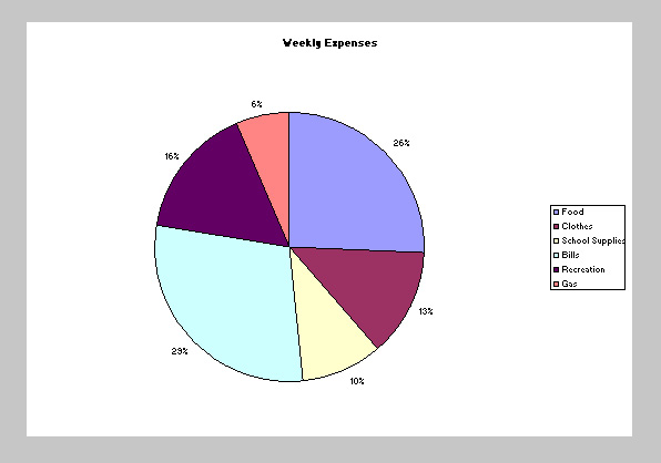
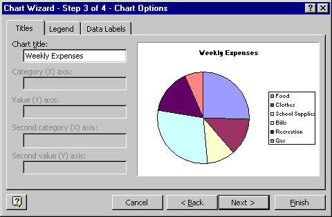
Select the Titles tab and then enter "Weekly Expenses" as the chart title.

Select the Legend tab and make the following adjustments:


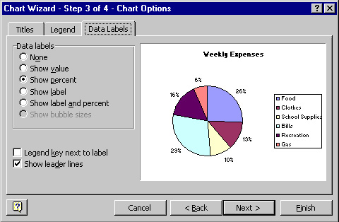
Select the Data Labels tab and select the following options:


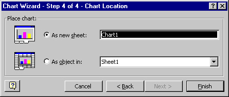
Select the following options and then click the Finish button.


Your expenses workbook should look as follows:


Save your changes.

Once you complete the ChartWizard, Excel displays the new chart sheet, the Chart toolbar (
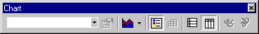
), and the chart menu bar. Note that if the chart toolbar is not displayed, simply choose Toolbars from the View menu and check of the chart box. The chart menu bar is similar to the worksheet menu bar, except the Insert and Format menus have some different commands.

Now that the initial chart is created, it is time to learn how to format it.

Next Topic: Formatting Charts
Main Menu